(Please note: This prototype is formatted for a desktop experience)
Boulevard Bikes
The Challenge
Create an e-commerce platform for a local Chicago business over the course of two weeks. I chose Boulevard Bikes which is a local bike shop with a minimally functioning e-commerce platform.
Design Practices Utilized
Research
- Competitive Analysis
- User Interviews
Synthesis
- Problem and Solution Statements
- Information Architecture Analysis
- Affinity Mapping
- User Personas
Execution
- Usability Testing
- Iterative Design
- Sketching
- Wireframing
- High-Fidelity Prototyping
My Role
This project was a solo endeavor. I was singly responsible for all research, synthesis, testing, and execution.
User Research
Competitive Analysis
I first ran a competitive analysis. This analysis compared the existence of 40 different features on seven different bike store websites spanning all of Chicago. There were a few key takeaways from this, the biggest and broadest being that there are a lot of retailers that have online storefronts. Even local retailers. Secondly, while there is plenty of variety in the features of online bike storefronts, there is a basic, refined formula that goes into a lot of the sites. Following pieces of this formula helped me establish the basic outline of my page.
User Interviews
I then reached out and e-mailed the owner of Boulevard Bikes to see if he had any interest in taking part of my research in exchange for free design. He boldly stated that he had no interest in developing an online store front and believed in the importance of brick and mortar business. I then managed to get two guerilla user interviews outside the storefront before getting kicked out. After that, I found two people I knew who both had shopped at Boulevard Bikes in the past as well as two people who had bought bikes online. I managed to get extensive interviews with all of them.
I had a few key takeaways from my user interviews:
- Users want to compare, customize and test bikes.
- Users want to buy used bikes.
- Users want a way to access the store’s policies.
- Users want to see the store’s services.
- Users want competitive prices.
- Users want control over the aesthetics of their bike.
From this information, I was able to formulate my problem and solution statements.
Synthesis
Problem Statement
As a city biker who is in the market for a new bike but unsure where to shop, I need a way to shop between an online and in-store experience because I will benefit from detailed specifications, access to staff, and a wide selection of bikes.
Solution Statement
Create an e-commerce website that allows its users to search for, compare, and buy bikes as well as schedule times to come in and test bikes. It would also allow users to chat with staff directly to receive expert advice on their purchases.
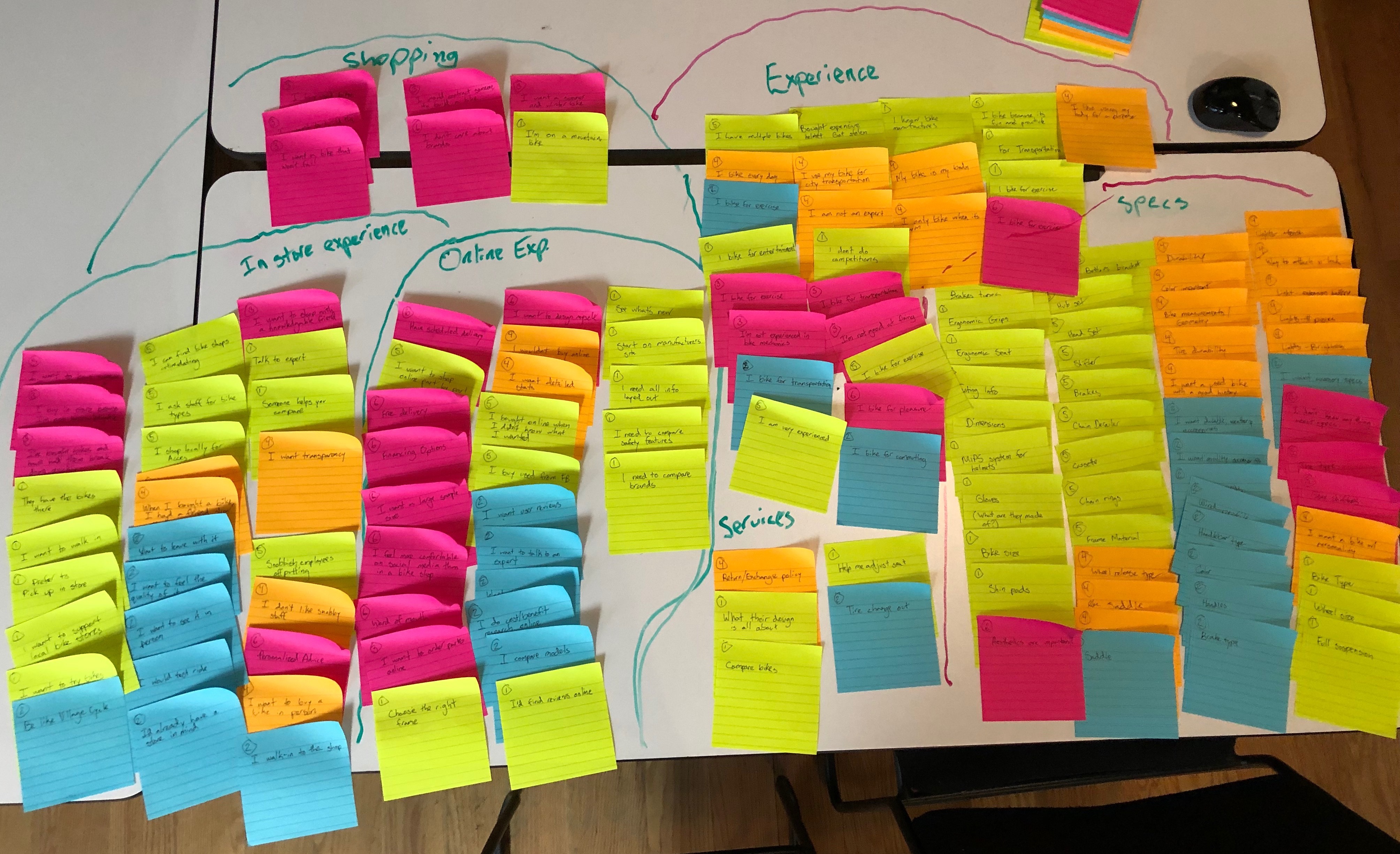
Affinity Map
Using this statement and my user research as a guide, I created an affinity map to diagram my progress. It is from this research that I was able to go back and refine the questions from my user interviews for potential future use.
Site Mapping
I performed an Information Architecture analysis on the existing Boulevard Bikes website by documenting its existing site map. The site map turned out flat, highlighting the original site’s static architecture.

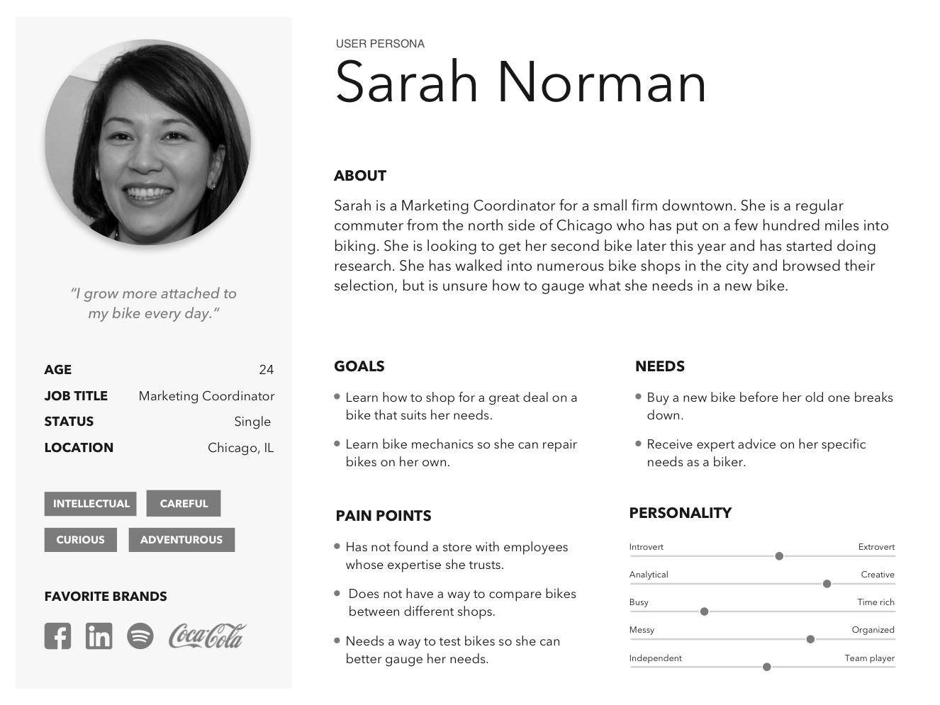
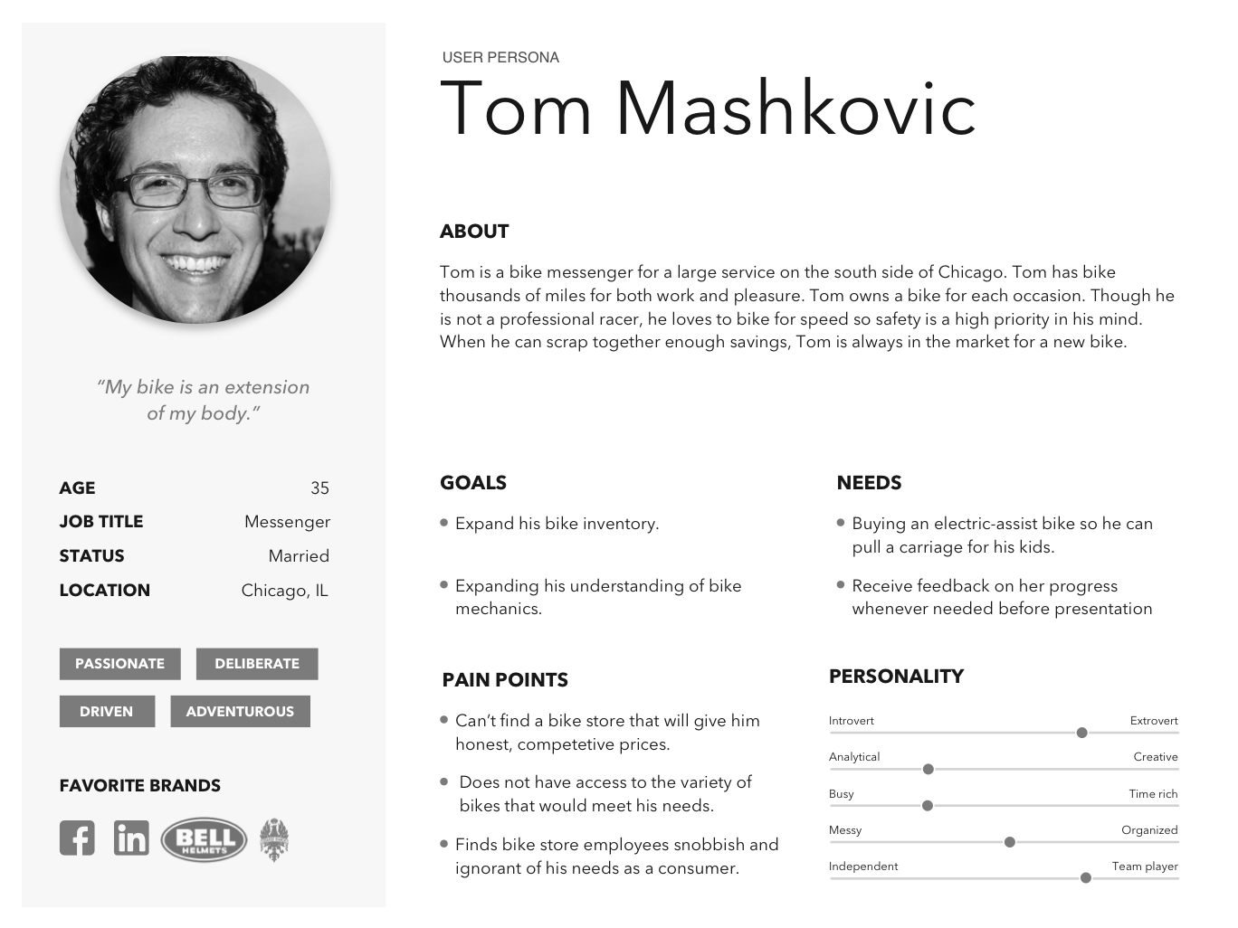
User Personas
These are personas generated as a culmination of all of my research and synthesis. The primary user persona, Sarah, represented an everyday biking enthusiast while the secondary persona, Tom, embodied a career bike messenger.
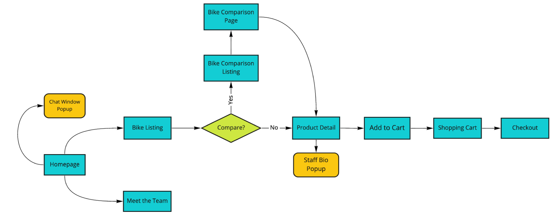
User Flow and Updated Site Map
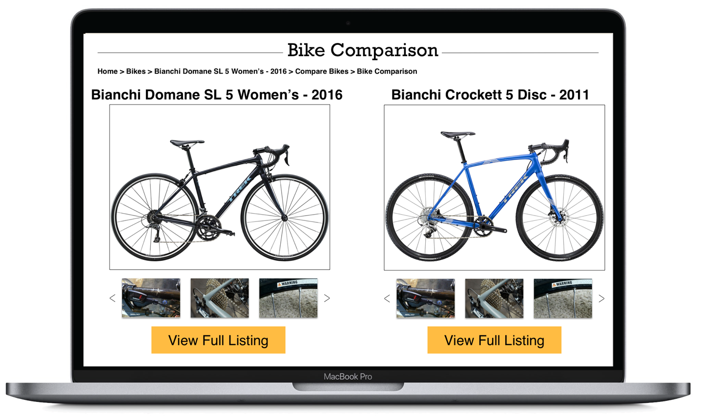
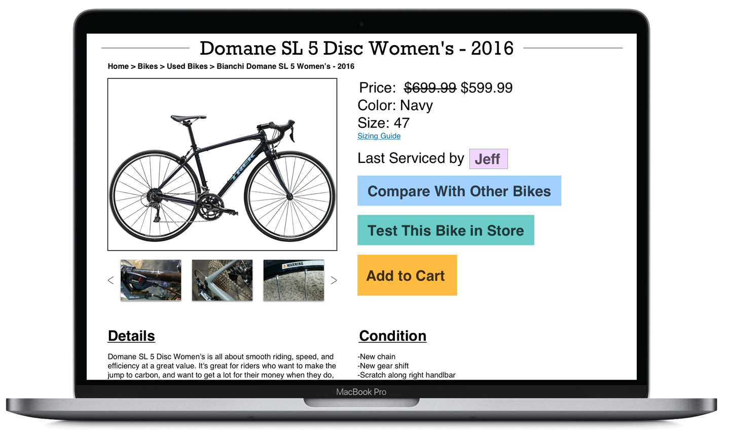
Next came an update to the site map. I included a bike comparison page which convoluted the depth of the site map as it looped around from bike details to bike comparison and back again. I also added a feature to shop for accessories as well as a cart/checkout function as the key points I would tackle in my prototype. From here, I created a user flow. The user flow was fairly simple. It introduced the ability to chat with the bike store staff via a small popup window in the corner of the screen as well as a way to view the biography of the last person to service your bike conveniently placed in the product detail page.
Execution
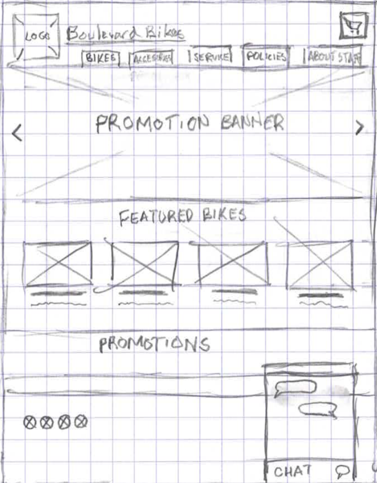
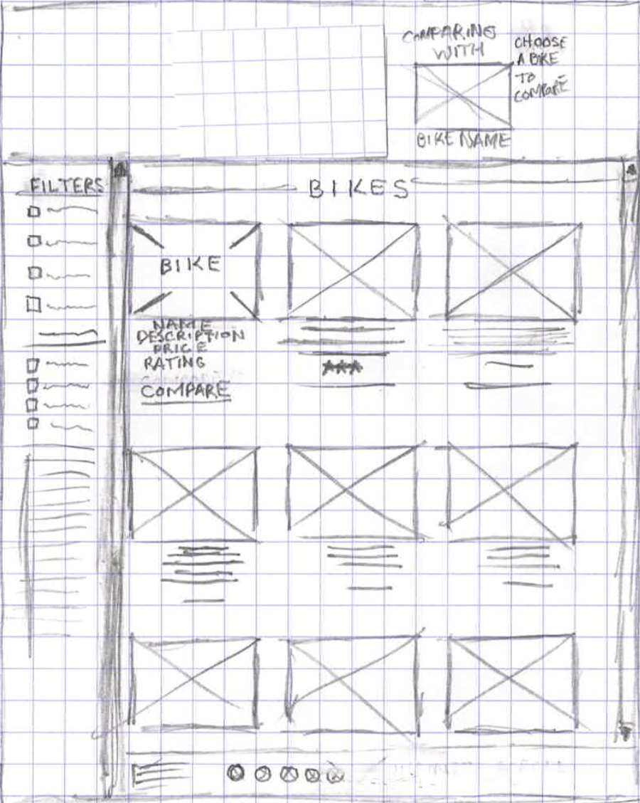
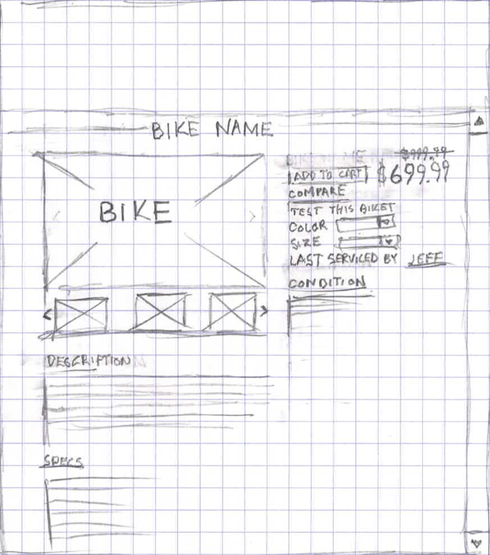
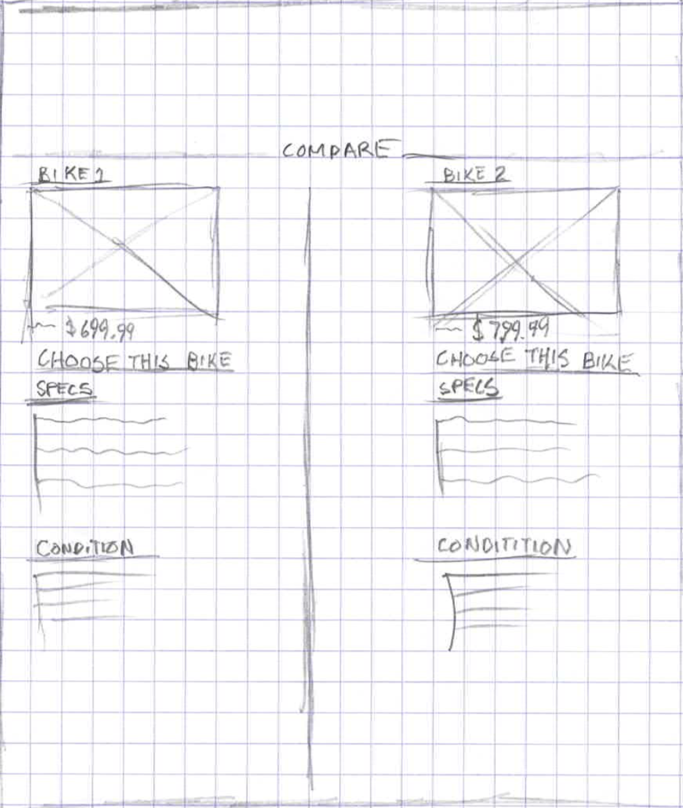
Paper Prototype
This is part of the paper prototype I used in the first iteration of this project. Test users were asked to navigate the site with a pencil as a cursor and the screens were navigated by hand.
Usability Testing and Wireframe
After adapting these sketches into a simple paper prototype, I was ready to begin usability testing. I found three willing participants who gave me feedback on the basic outline as well as the usability of the site’s unique features. From these critiques, I was able to move forward into a digital wireframe.
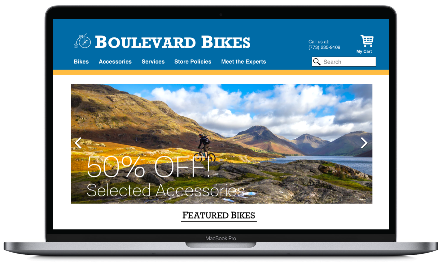
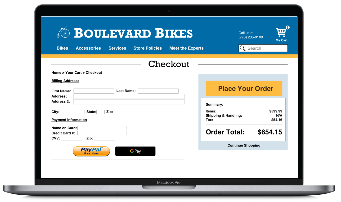
In my final round of user testing, the changes I made to the UI were considerably less dramatic. I added Paypal and GPay buttons to the checkout for convenience’s sake. I adjusted the payment system to limit the amount of names a person could include on their checkout for clarity. I adjusted the text on several buttons to make their functions more obvious at first glance. A huge change was simply adding contact and location information on the front page in a spot where they could easily be found.
High-Fidelity Prototype
This video showcases a completed, high-fidelity iteration of a digital prototype.
Branding
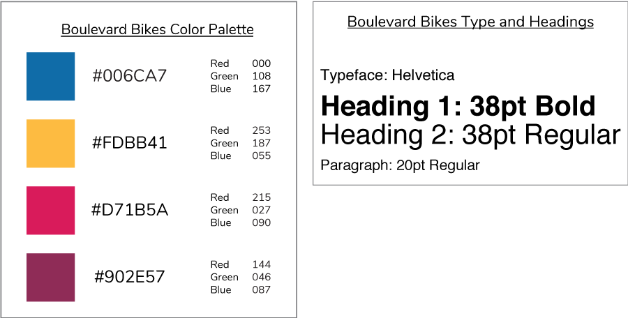
These are screenshots of branding documents that would be passed on to engineering or directly to the client as a means of keeping design and engineering on the same page.
Project Takeaways
- Choose your user interview questions carefully. Don’t guide participants into what you perceive might be a solution.
- Perform a contextual inquiry to better understand how users flow through the current site.
Next Steps
- Flesh out compare feature further.
- Create a feature to schedule bike testing.
- Implement a sizing and geometry guide into the bike details page.
- Make the chat window easier to find.