Bartleby’s Ice Cream Cakes
The Challenge
Our assignment was to design a site for a local business. This was a live client project, so we were working closely with the client to build her solution. The owner of Bartleby’s Ice Cream Cakes, Rachel Kamins, came to us thinking that there was an issue with her ordering system.
Design Practices Utilized
Research
- Direct Competitive Analysis
- Indirect Competitive Analysis
- Heuristic Evaluation of Current Site
- Screener Survey
- User Interviews
- Client Analysis
- Contextual Inquiry of the Bartleby’s website
Synthesis
- Affinity Mapping
- Personas
- Journey Mapping
- Problem and Solution Statement
- Site Mapping
- User Flow
Execution
- Sketching on Paper
- Usability Testing
- Iterative Design
- Digital Wireframing
- Digital Prototyping
- Coded prototype development
My Role
My role in this project ended up being more extensive than I though it would be. After research and synthesis, I ended up creating a live, coded prototype for the client which she expressed a deep interest in adopting.
My Teammates
User Research
Client Interviews
From our client interviews, we were able to get a grasp on how the business worked internally as well as the pain points that the client believed were getting in the way of her business. Among them, and quite possibly the most important one of them, was that the delivery service would not integrate the client’s Wix Restaurants page. While the delivery service, Deliv, had an API that could theoretically connect it with external sites, Wix Restaurants could not support any communication with it. The workaround for this was that the customers ordering online would have to include a note in the special instructions that they would want delivery and the office administrator would call and manually put the delivery into the system. Improving this delivery system turned out to be the crux of our solutions.
Heuristic Evaluation
The heuristic evaluation that we ran afterwards shed light on the fact that the ordering system was a major pain point. While clicking around and exploring the site was fairly intuitive in most ways, it took several more steps to order than it did for anything else.
Screener Survey
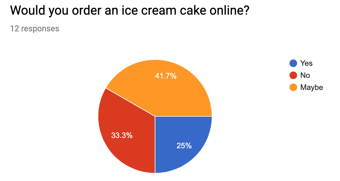
We sent out two screener surveys resulting in 36 responses. From the first survey we were able to derive the facts that a majority of responders would order a cake for a birthday party; Ice cream is the most common choice of dessert among users; and users fear that ordering ice cream cakes online would result in it melting upon delivery.
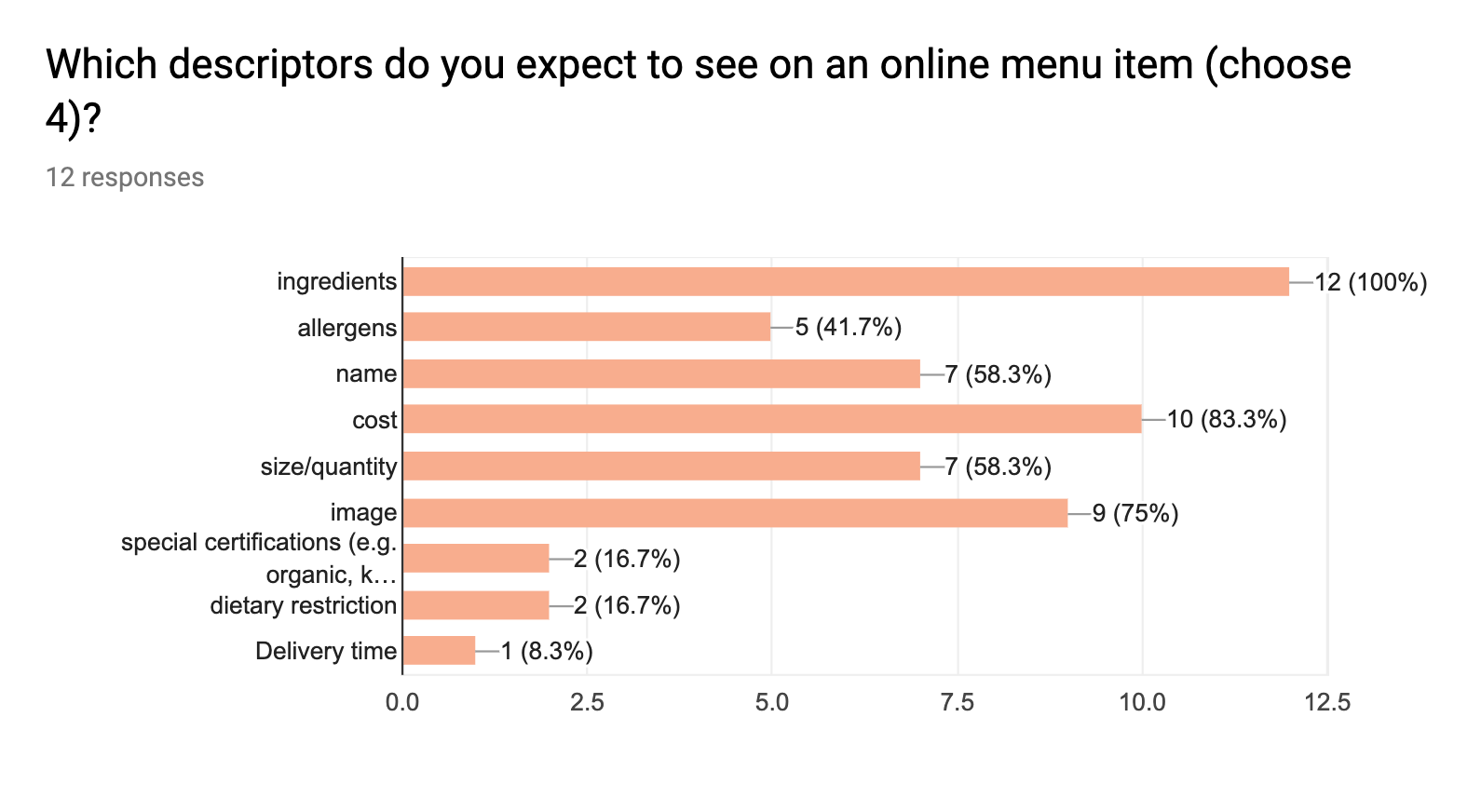
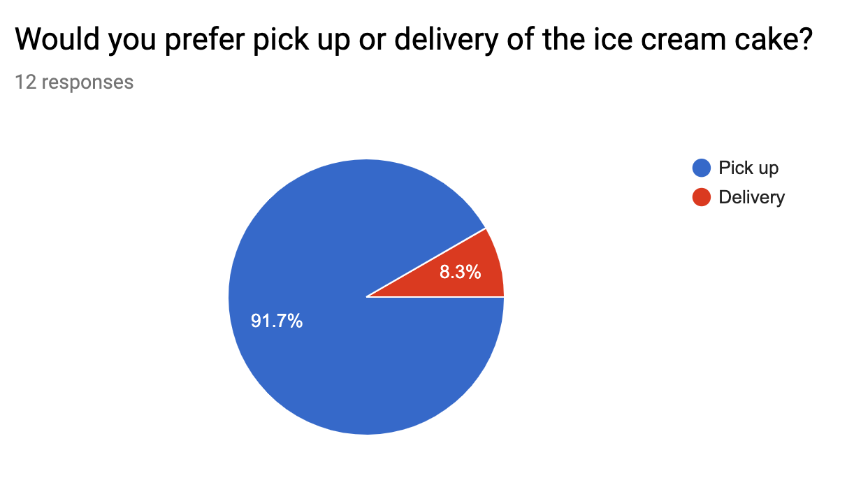
From the second survey, we found that word of mouth is the most trusted source of reviews among responders. We also found that a vast majority of users would prefer to pick up an ice cream cake from a shop rather than having it delivered. Finally, we found that ingredients were the most commonly requested descriptors in online menu items according to interviewed users.
Contextual Inquiries
Our contextual inquiries were our key source in identifying issues with the current site. Users were not reading the instructions on the order page so some testers assumed that they were unable to order delivery at all. Testers complained that the instructions were too wordy. One tester even thought “Nobody is ever going to read that.” There was also a navigation bar at the top of the page which traveled with the page as the users scrolled with it. Testers found this distracting. On the order page, there was a favorites section which contained a list of cakes which were not customizable. Testers were confusing as they were mixing them up with customizable cakes. Lastly, there was a delivery option available on the page that was not functional. If a user selected the ‘Delivery’ and scheduled a time to have their cake delivered, the site would immediately switch the option back to ‘Pick Up” upon checking out. This lead even more of our testers to believe that ordering delivery was impossible.
Customer Interviews
Through the owner and administrator of the company, we were able to land three interviews with existing, recurring Bartleby’s customers. While the users gave us some good insight, many of them were so impressed by the accomidating service of Bartleby’s and, most importantly, the taste of the cakes that they drew the answers to all of our questions back to the quality of the cakes and service. This presented a problem as we were only able to interview satisfied customers and not customers that had had difficulties with the site or the business.
Still, we gleaned a few insights. Some users wanted to see a cross section of the cake to inform them about the interior structure of the cake. Many customers agreed that the were worth the price.
Synthesis
Problem Statement
As a person planning an event, I need a local business that makes customized desserts from high-quality ingredients and offers online ordering and delivery because of my busy schedule.
Solution Statement
We believe that by creating a streamlined customization process for these busy customers, we will achieve a better ordering process. We will measure our success by a) increased engagement on the site [measured by Google Analytics], b) increased customer satisfaction [as reported through customer feedback], c) and a higher number of orders on the Bartleby’s site.
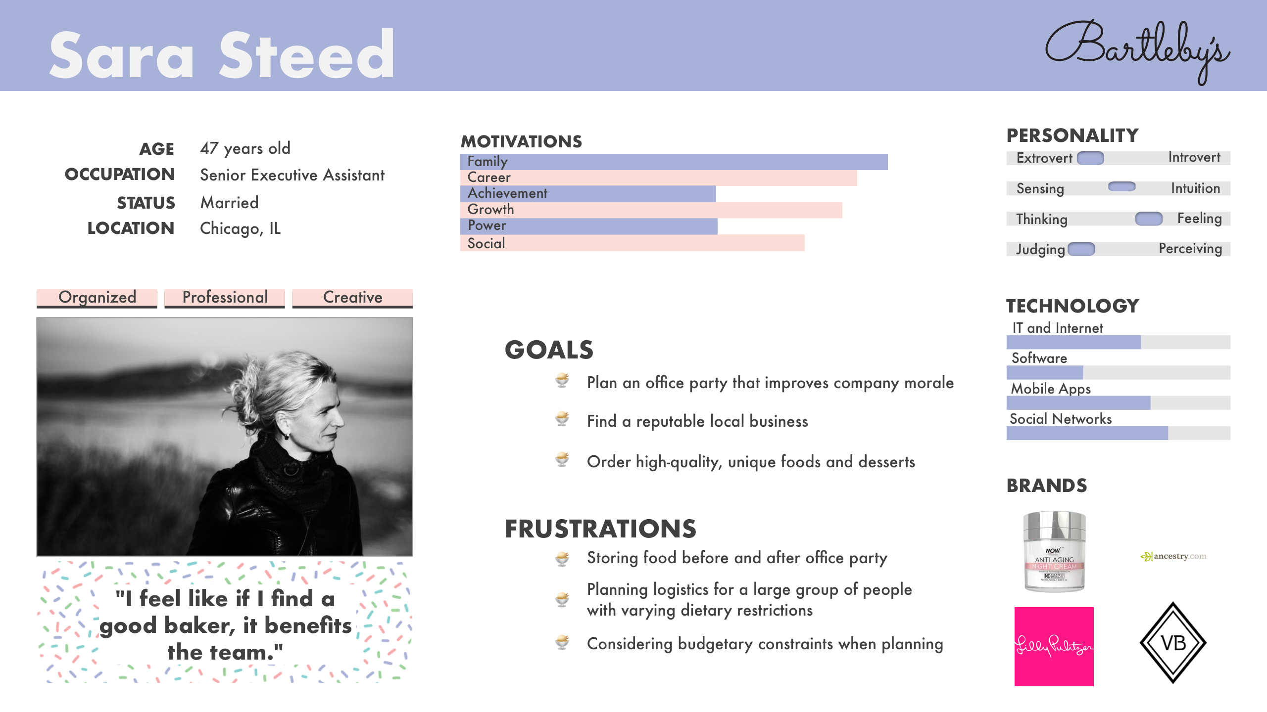
User Personas
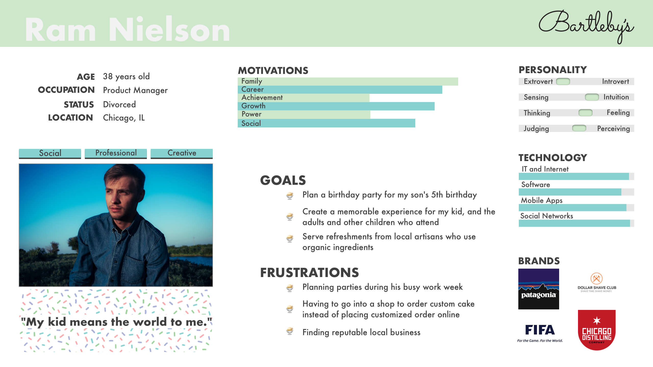
Both of our user personas were “primary” personas as the user flow does not differ; only the motivation for purchasing. Our The personas created from user interviews and based on the demographics pulled from surveys and given by stakeholders. Our users were Sara Steed, a business admin looking to purchase cake(s) for office events, and Ram Nielson, a father looking to buy a birthday cake for his children.
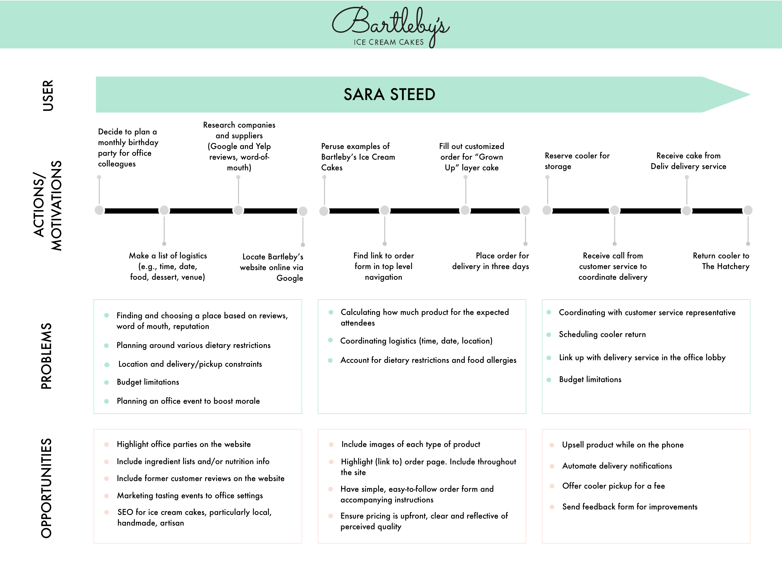
User Journey
My colleague, Sierra Cheatham, created a journey map following Sara Steed’s fictional journey through buying an ice cream cake from Bartleby’s.
Design
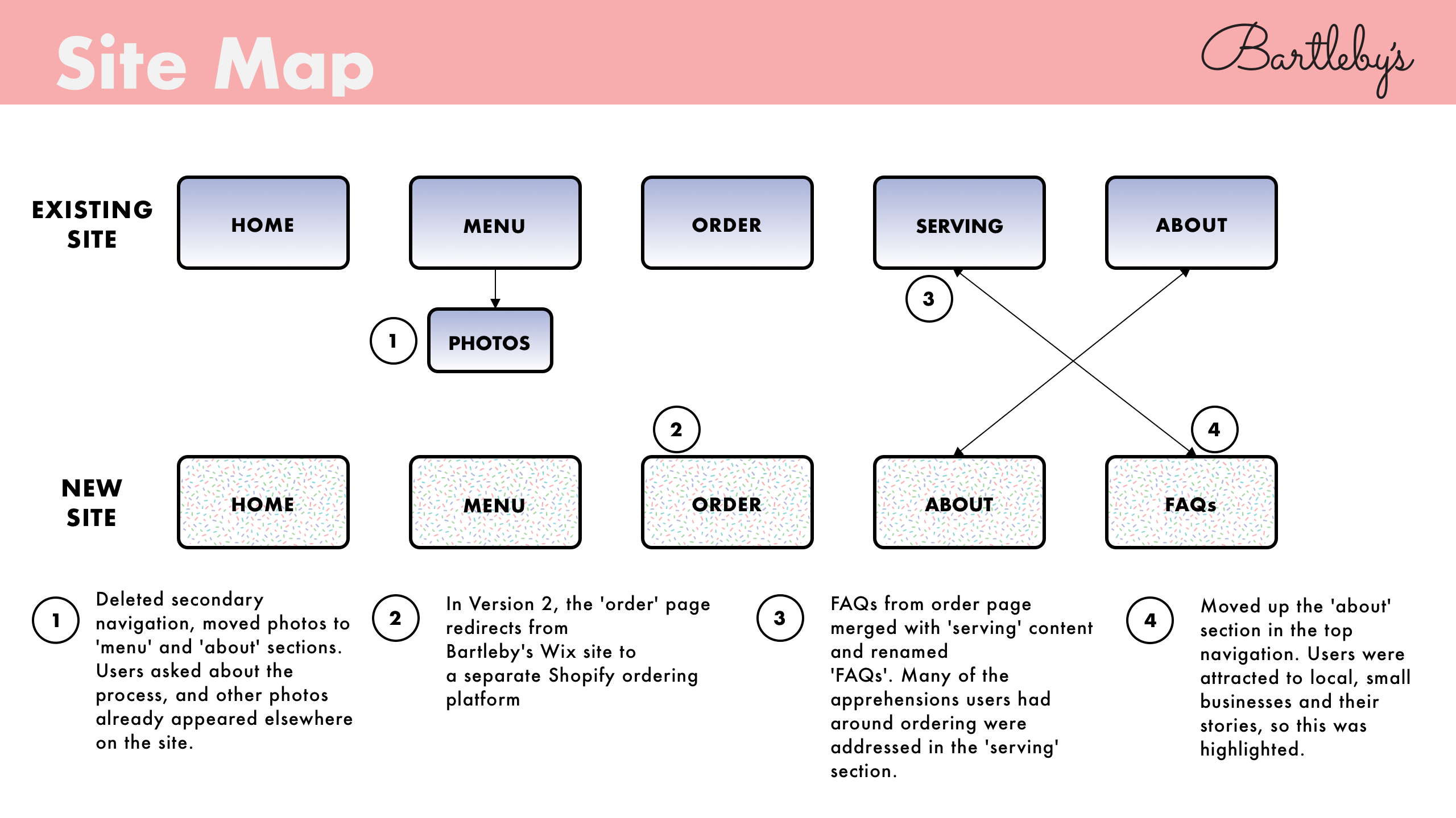
Site Map
For the first step of the design process, we updated the working site map. Below are the changes and reasoning behind each change.
Split Off
At this point, I had an idea. I did some research personally, and got on the phone with Deliv, the client’s delivery service. Through them, I found that we could integrate the client’s delivery system using Shopify along with an application called Zapiet. This would solve the client’s problem of not being able to hook their delivery service’s API up to their Wix website. I made sure that the Zapiet/Deliv integration was able to address some additional pain points that the contextual inquiries had identified. Once this was a go, I set to work looking to see if there was a way to make Shopify do everything that the Wix site could do and more. I was able to find an app called Product Customizer that allowed us to add some remaining features that were missing from the shopify workflow. With all of this put together, I set out to design and code an alternative store in Shopify.
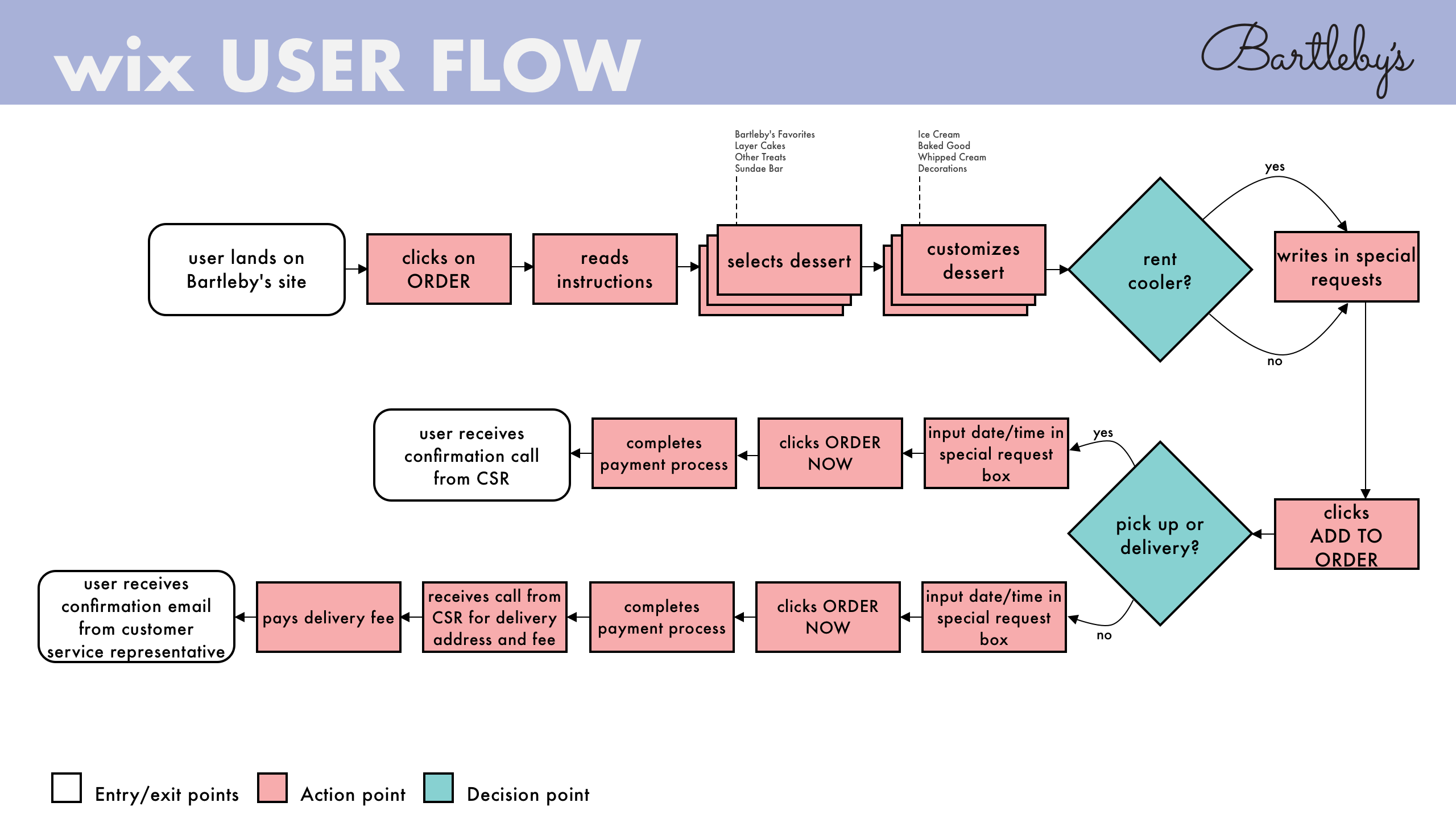
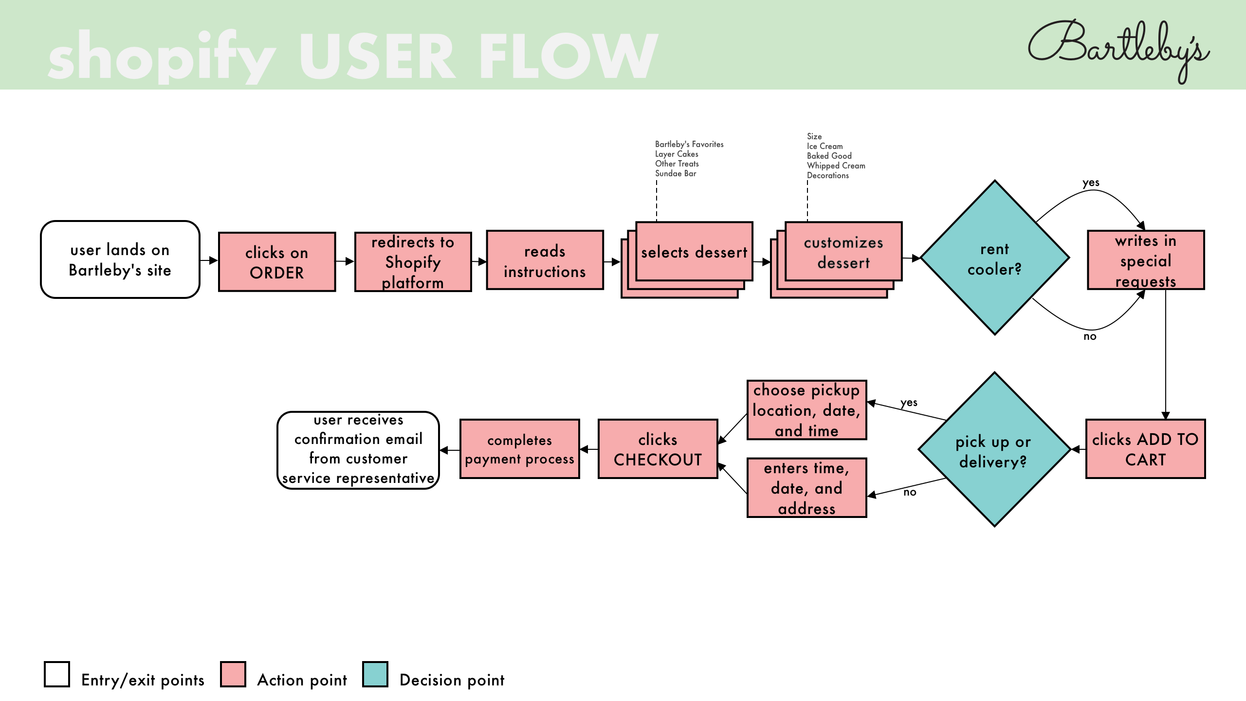
User Flow
Our user flow captured the potential routes that users could take through both solutions of the e-commerce portion of the site. These were assembled by my colleagues.
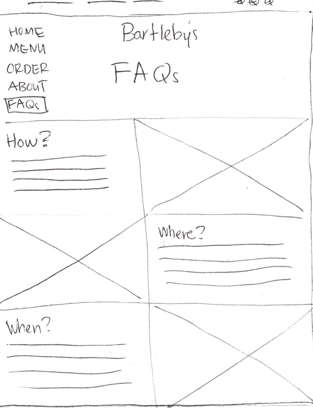
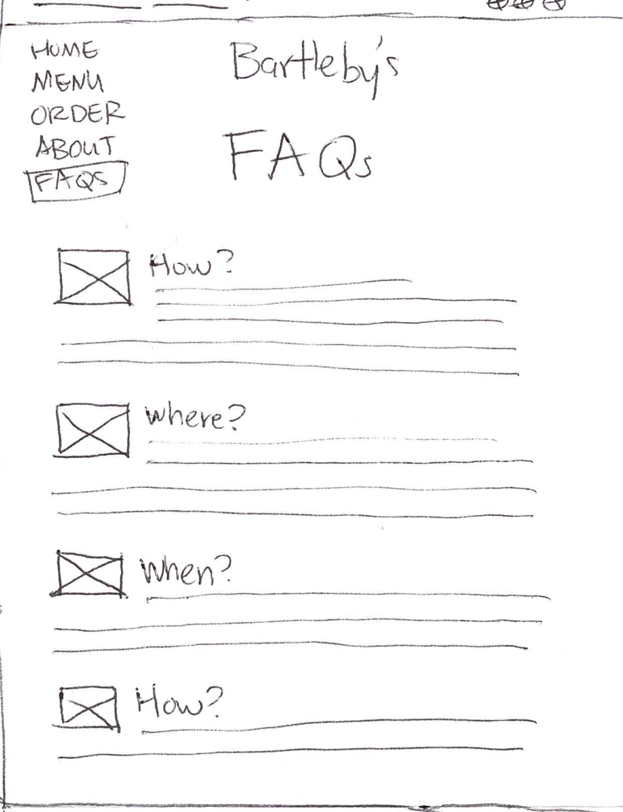
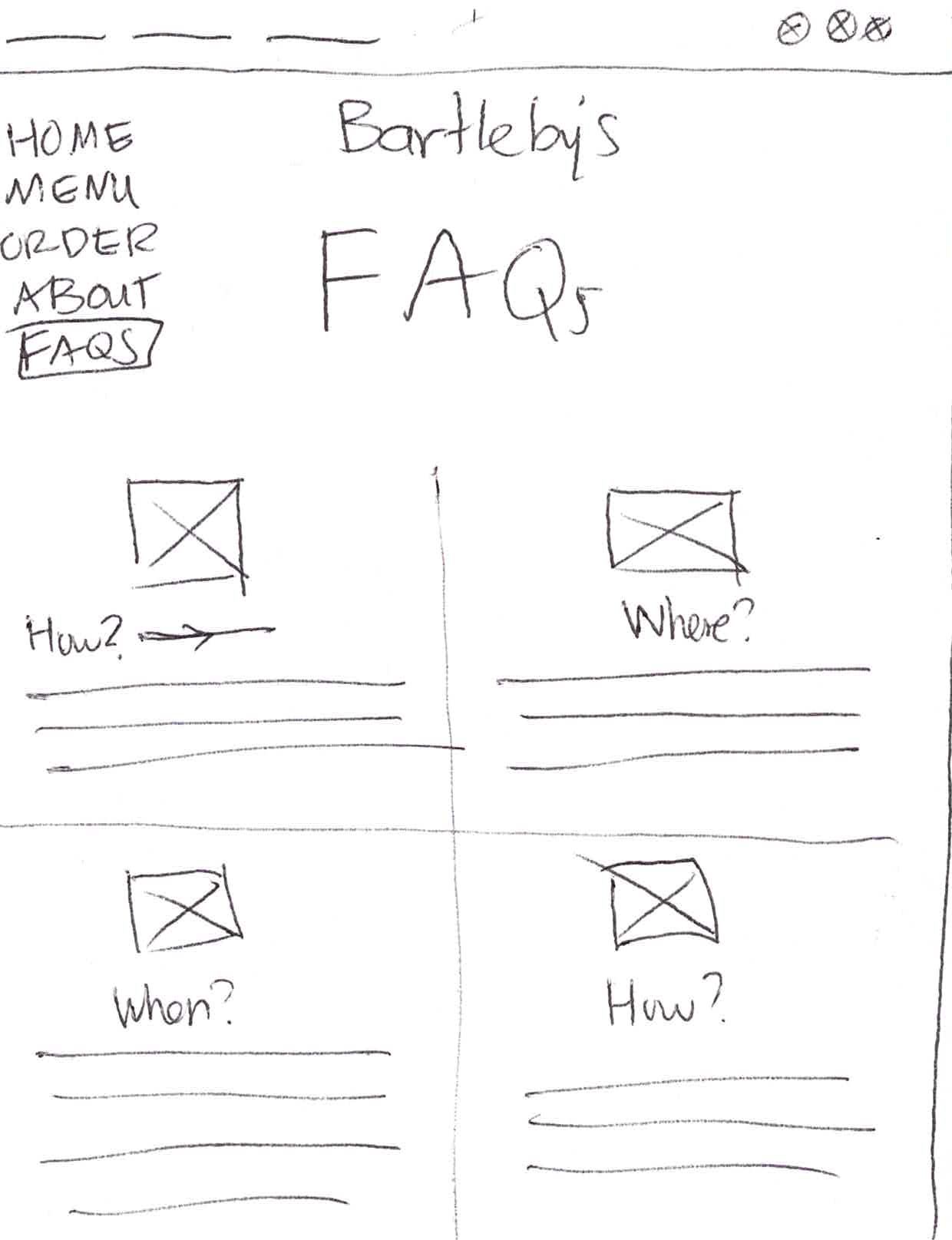
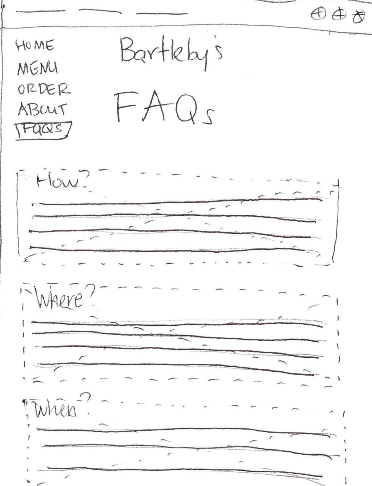
Sketches
The next step was to sketch out potential layouts for each page. These sketches show different layout ideas for the FAQ page.
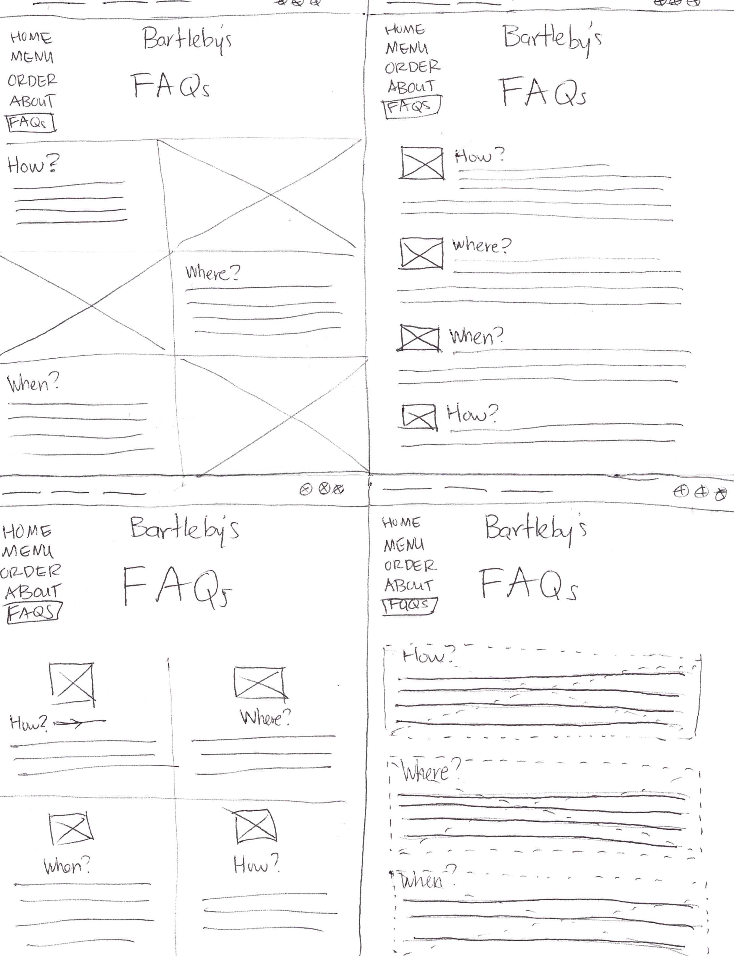
Wireframes
We needed to wireframe the sites after that. The following are a few of the wireframes we generated for our first round of usability testing.
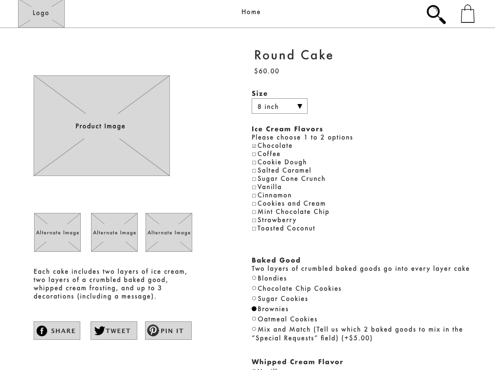
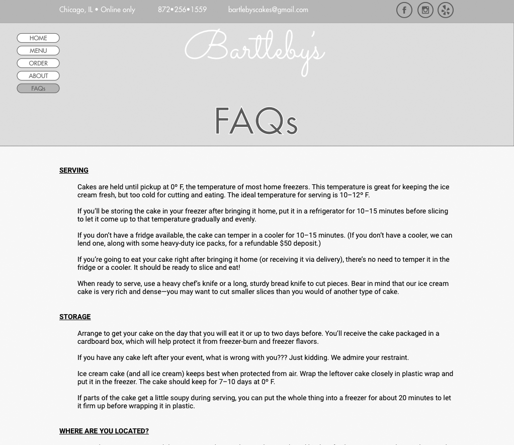
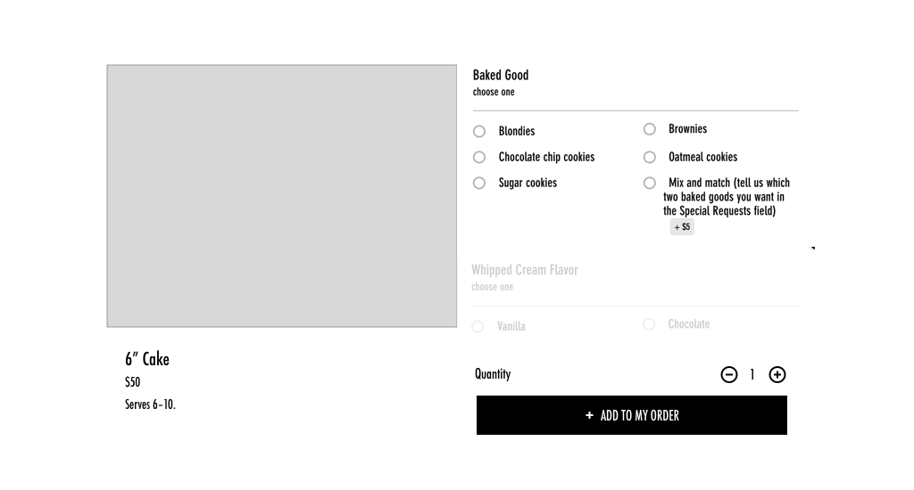
Walkthrough of the Shopify website:
Next Steps
Our client was thrilled with the Shopify prototype and wanted to adopt it. I turned over the account to her and she has since worked on integrating it into her site. I will be working closely with the client to ensure that this solution gets implemented and goes live.